Final Film
- May 1, 2019
- 1 min read
A second draft has allowed me to refine the sequence of shots to convey the story more concisely and I was able to cut some of the action to allow the audience to digest the plot more naturally while adding in some room for contemplation in the shape of pauses.
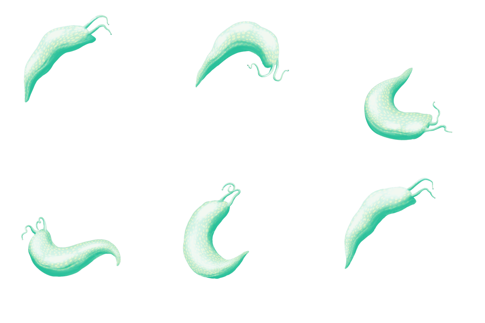
While initially concerned that the backgrounds would be too simple (even boring) alongside the monochromatic colour palette, I like how it shows a stark contrast between life outside and within the stomach and found that adding some definition to the ground helped ground the characters. I had hoped to colour the characters themselves, but time restrictions didn’t allow for this. Having fully animated the film though, I don’t feel that colour is necessary, though it might have contributed to a more ‘finished’ feeling film aesthetically… and I can’t help but feel the simple line-work is missing something, perhaps even some shadows - so this is something I’d have liked to add in


Comments