Animatic
- Feb 9, 2019
- 1 min read
Updated: Feb 28, 2019
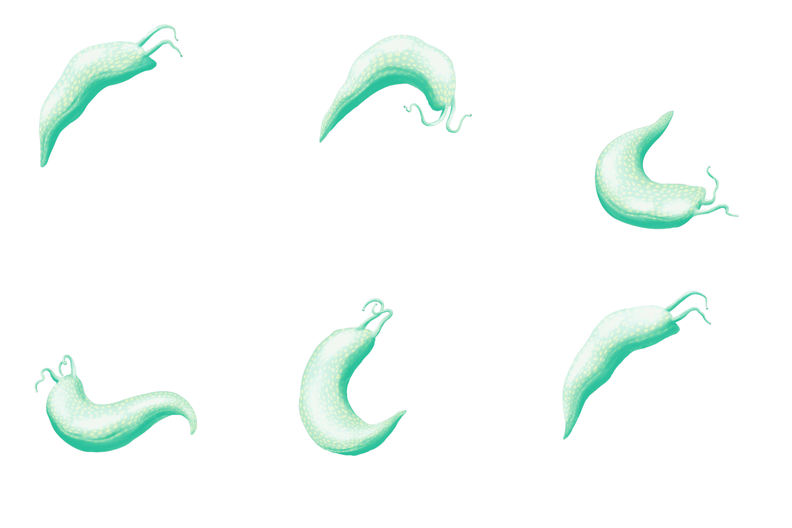
Using my character designs and storyboard, I assembled an animatic in Photoshop to give me a sense of timing and to assess how the narrative flows.
Having showed the animatic to Alan, we determined that there should be more ambiguity around the size of the monster so that when he is revealed next to the house, there is more impact. Additionally, the introduction of the second character should be presented in one shot - he grows out of the distance, initially just a blur - rather than seeing him emerge from the trees beforehand.
To build a sense of character, I'll give the monster some kind of 'tick,' this will also add interest.


Comments